Repetition
I liked this repetition technique, because I believe it adds to the abstract pattern that the Twiglets were already portraying. By flipping the image 4 times and having a symmetrical reflection at every point in the piece, it makes the pattern a lot more effective. Repetition can transform a cluttered picture into a tidy and well structured pattern.
How I created it: I flipped and saved these four separate images, and then merged them together in one frame until the dimensions and measurements were symmetrical and accurate.
Black and White
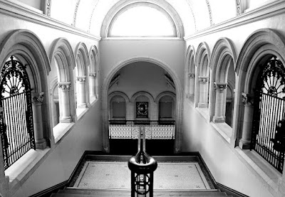
This effect simply makes any photo appear more dramatic, as you can increase the curves and have the black and whites contrast effectively with one another.
How I created it: I applied the black and white effect to this piece and altered the curves to make the photograph more dramatic.
Framing
How I created it: I used an online editing website for this piece as I wanted to use this mirror frame that I introduced myself to in my previous project.
Image and Text
As advertising has been a common theme in my work, I believe that this image and text technique is effective for specifically advertising a certain something. For example, in this piece I am displaying M&M's, and interacting with the audience by asking them what colour M&M is their favourite. Image and text is an extremely effective way of communicating with customers, therefore something that I found to be one of my most successful print technique.
Selective Colour
The technique selective colour is my most favoured print technique of them all, as this allows a focal point to be emphasised. The red and white lolly pop is the subject in this frame that provides the pattern, whilst everything else is practically irrelevant. Therefore, by using the selective colour technique to illuminate this feature, I am exaggerating the pattern whilst doing so.
How I created it: I used the select tool to select the lolly pop, inverted the selection and applied the black and white effect to allow the colour of the lolly pop to be the only visible spec of colour left.
Overlay
By using overlay, I am displaying a combination of patterns instead of just one.
How I created it: I pasted one image over the other and altered the opacity tool to make both images visible, but also sadly losing the depth whilst doing so.
Montage
This is also another one of my favourites from this post. I think it is extremely successful to create a montage of images that have all been captured from my location shoots, as this portrays a mixture of pattern and allows each picture to entwine with the other, even though they were all taken at different times. This also creates an irregular pattern which emphasises my project.
How I created it: I merged an assortment of my location photography into one frame, and used the transform tool in Photoshop to adjust the scale and rotation.
Soft Focus
Soft Fofus acts similarly to selective colour, providing a focal point for the audience by separating two features in the frame.
How I created it: I selected Danielle's figure and used a blur tool to smudge the background.
Weaving
By weaving a photograph, I am interrupting the current pattern in the frame but also creating another one to compliment the original.
How I created it: I applied the weave technique on another photo editing website which gave this effect below.
Duotone
How I created it: I altered the colours in this piece by decreasing the saturation and increasing the blur tint to make it cold.
Multiple Imagery
Multiple imagery is similar to creating a montage, as I am displaying more than one pattern photograph - except for this technique I used the same image to test what looked most effective. I liked the different perspectives and scales that doing it this way portrayed.
How I created it: I added six images to one frame and adjusted the scale on each one until I created a neat outcome like this one.
Photojoiner
By creating a photojoiner, I have, like weaving, interrupted the pattern yet created another one to compliment it as there are now doubles of certain sections of the bottles which adds to the absurd and abstract pattern on the packaging.
How I created it: I added multiple images into the frame and used the transform tool to adjust the scale of each picture, dragging it over other pictures to create layers and overlap certain segments.


No comments:
Post a Comment